
A book’s cover design is art packed with purpose. Integrated artistic elements must capture attention, express theme, and encourage action—all in mere seconds. With so much to consider, how does a book designer approach such a task? What makes a particularly powerful design? Join us as we hear from Tyndale House designers Julie Chen and Dean Renninger about the stories behind the favorite book covers they’ve created!
 Julie Chen: The Big Book of Bible Questions
Ever since I was a child, I was enamored with children’s picture books, as well as drawing and painting. When other girls in high school would collect albums or makeup, I started collecting illustrated books. I pursued a Bachelor of Fine Arts degree with a focus on illustration, so that I could become an illustrator one day. But it is hard to make it as an illustrator full time, so I was then blessed to get into designing books instead, and I totally fell in love with the process. Anytime I am given the opportunity to design a children’s book, I jump at it. I love working with illustrators and channeling the knowledge and experience I gained in college to understand how to direct them: giving them clear boundaries while allowing them freedom to be themselves.
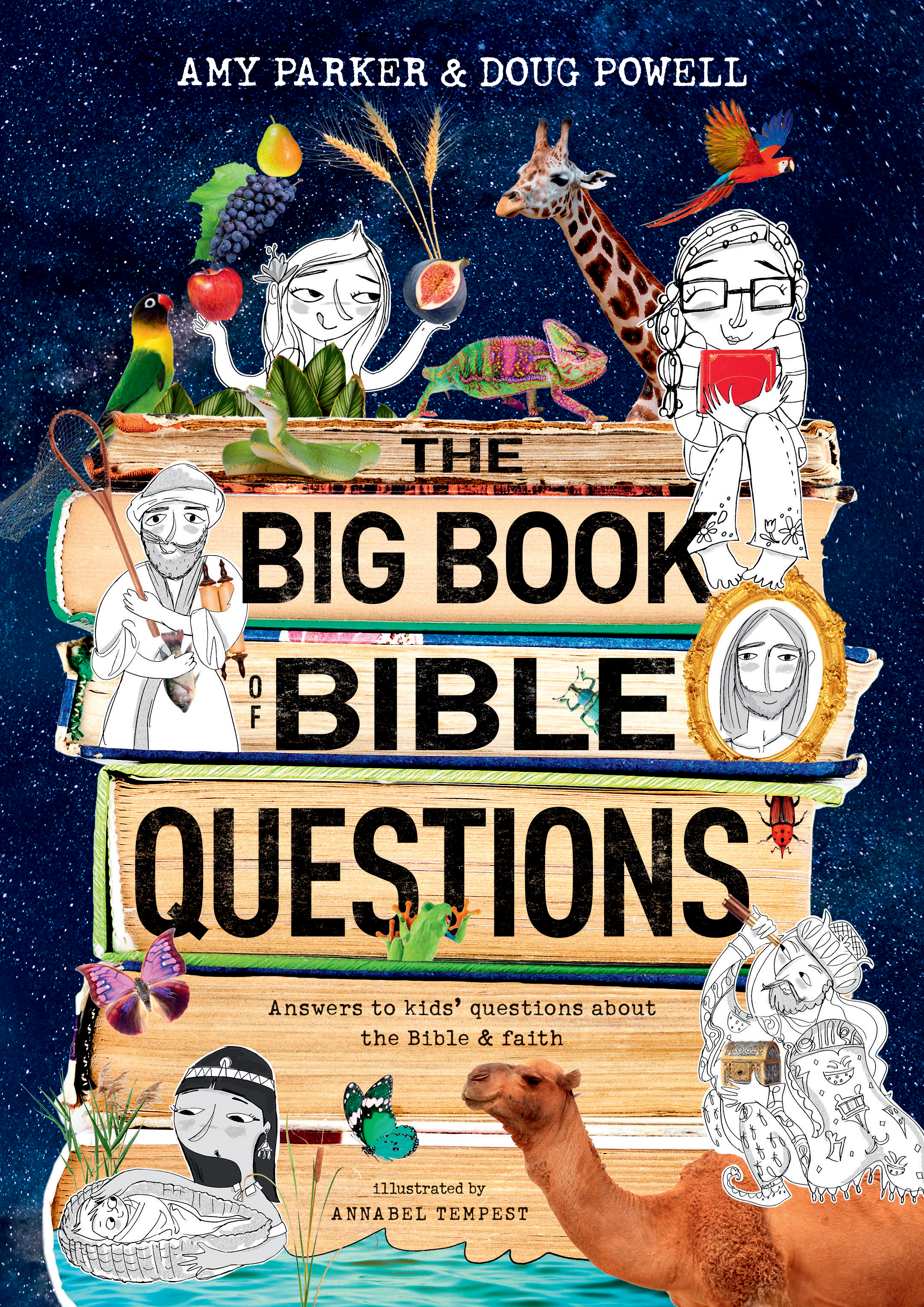
My passion for children’s books grew when I became a mother. Reading has been an essential value in our home, and to be honest, it became an excuse for me to pour into more children’s books at the library! There are so many art styles that I love and appreciate, but I think the child-like spirit in me is drawn to art that is whimsical in nature. So, when I was assigned to design The Big Book of Bible Questions, I immediately knew that I wanted to develop a product that was fun, whimsical, and visually intriguing to kids. Since a lot of the content of the manuscript was quite lofty and deep—including questions like, “Who made God?” or “Why do people believe different things?”—I made it my goal to visually connect with children and make learning fun, so that they did not feel like this was a school textbook.
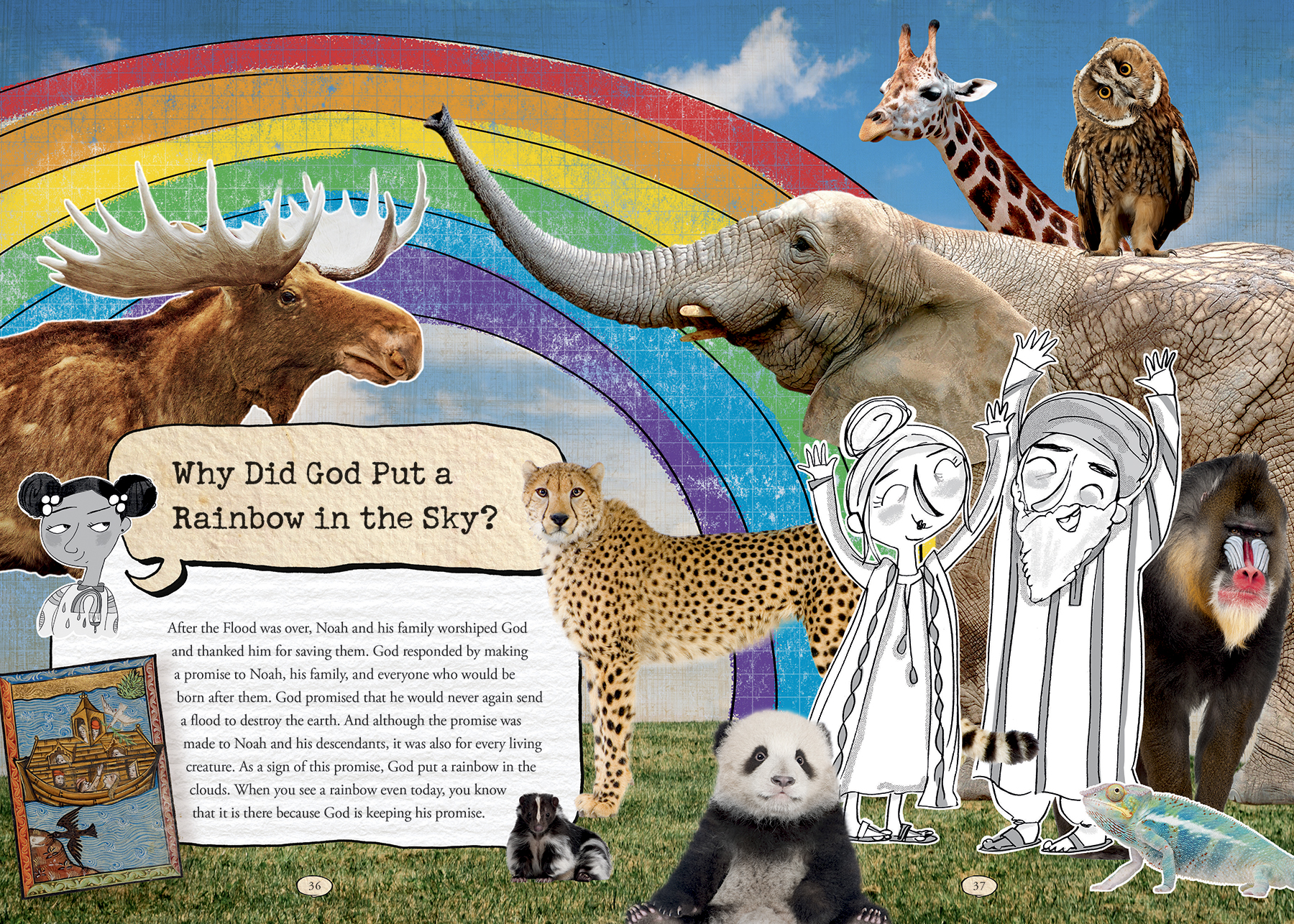
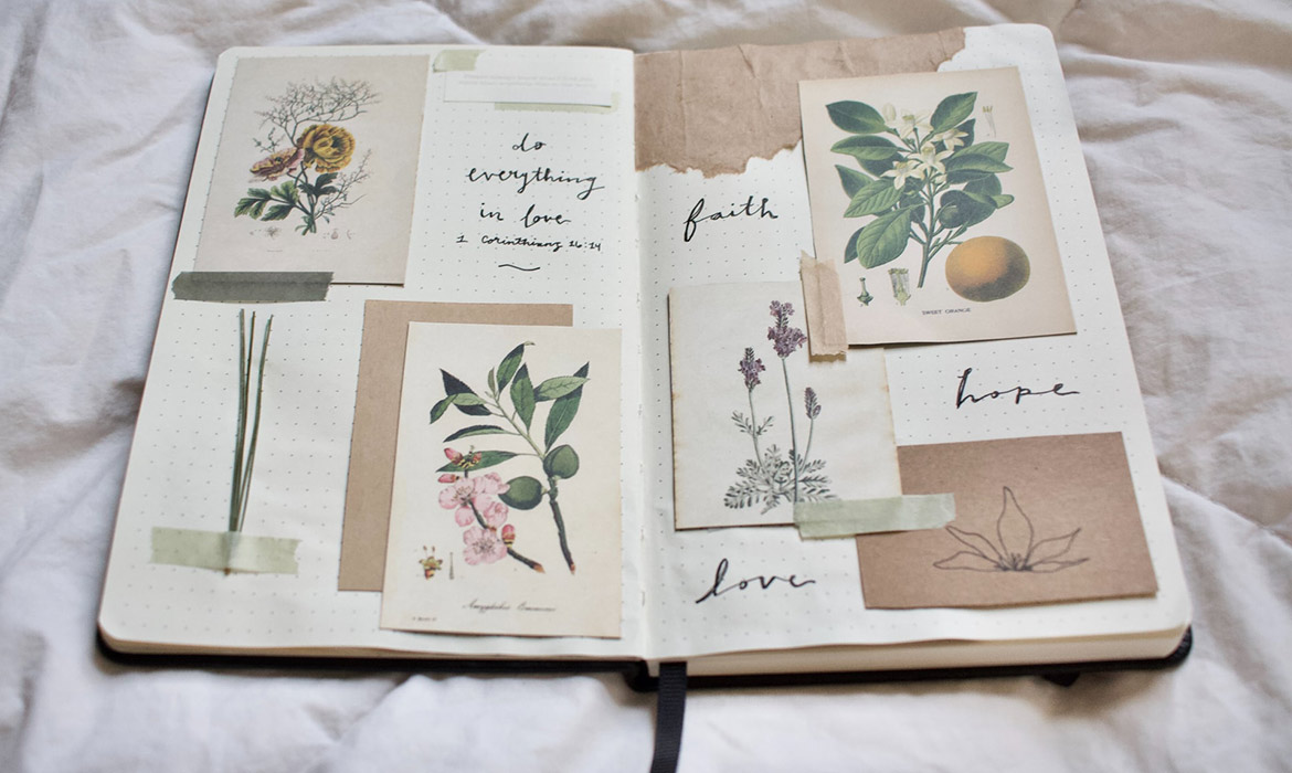
In creating the interior, I wanted to combine historical elements of art, archaeology, and maps to give the book the historical authority it deserves. The authors are very well-known for their research and knowledge. But, again, I did not want the overall look of the book to feel unrelatable to our modern-day kids, so for every spread, I decided to create collages that combined black and white sketches—childlike and imperfect in nature—along with bright, full-color photography.
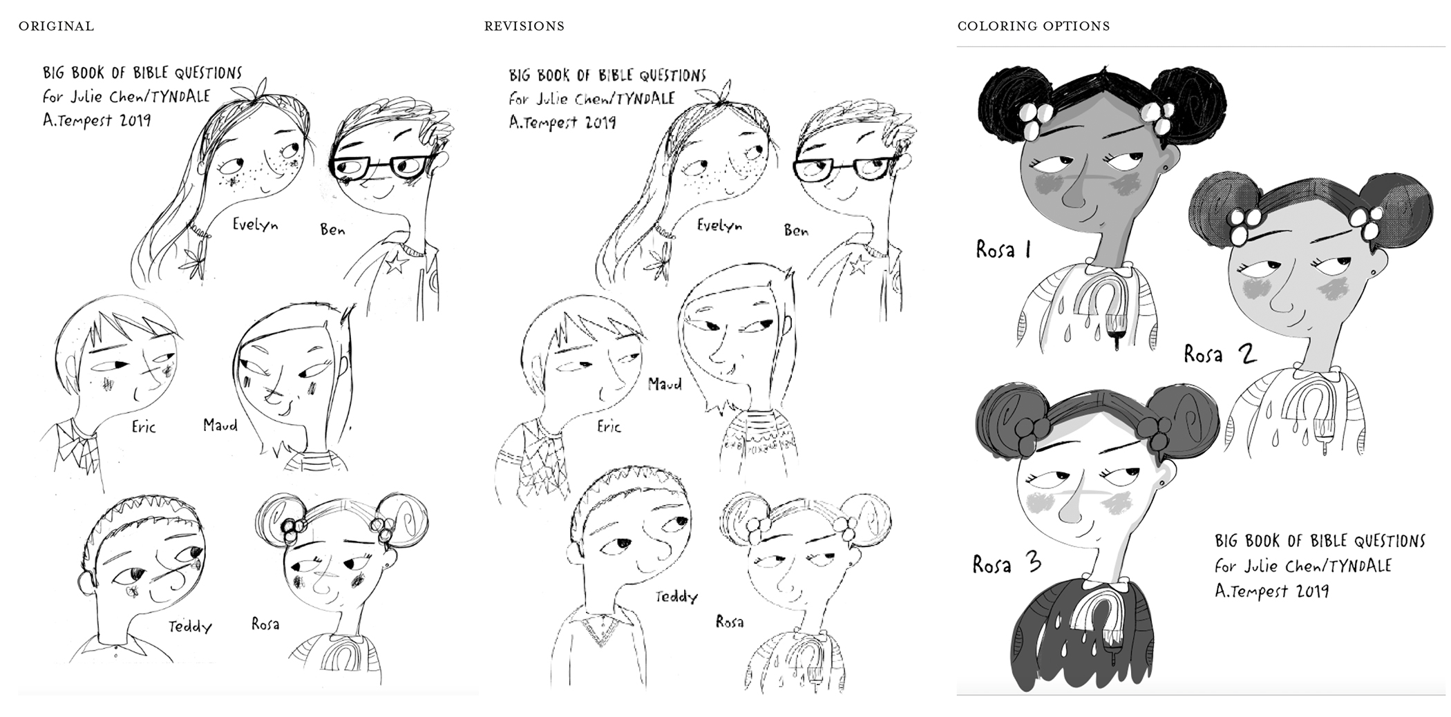
When it came to choosing the illustrator, I had long admired Annabel Tempest, who also illustrated Wow! for Tyndale. Her style and whimsical nature was perfect, and I knew from my art director that she was a dream to work with! One fun fact about working with Annabel: we created six kids to be like narrators throughout the book and ask the Bible questions. When she sent in the character sketches for those kids, she had also named them, which furthered their personalities! It was pretty fun to see our illustrator go above and beyond and really get into the characters right from the beginning.
Out of all of my Tyndale books, this project has been my favorite because I was fully able to use both of my passions: illustration and design. I just love how it turned out and I love the secret little things I put in the book that relate to my own children. I hope families will sit with this book for hours and pour over the content and have great spiritual conversations about the deep questions they have about their own faith!
Discover more of Julie Chen’s art at her website here!
Learn more about The Big Book of Bible Questions by Amy Parker and Doug Powell here!
 Dean Renninger: What Is a Girl Worth?
As a young designer, I found myself enamored with what a cover looked like more than the meaning behind it. The “best” and “coolest” covers were the ones that pushed the boundaries of design itself to catch a reader’s attention, sometimes regardless of what the content inside them was like. But as I’ve grown older, I find making “cool” covers or pushing the edges of design isn’t nearly as important as expressing the content of the book. If a cover doesn’t represent the book’s content well, it’s not going to be effective at drawing readers into the story within.
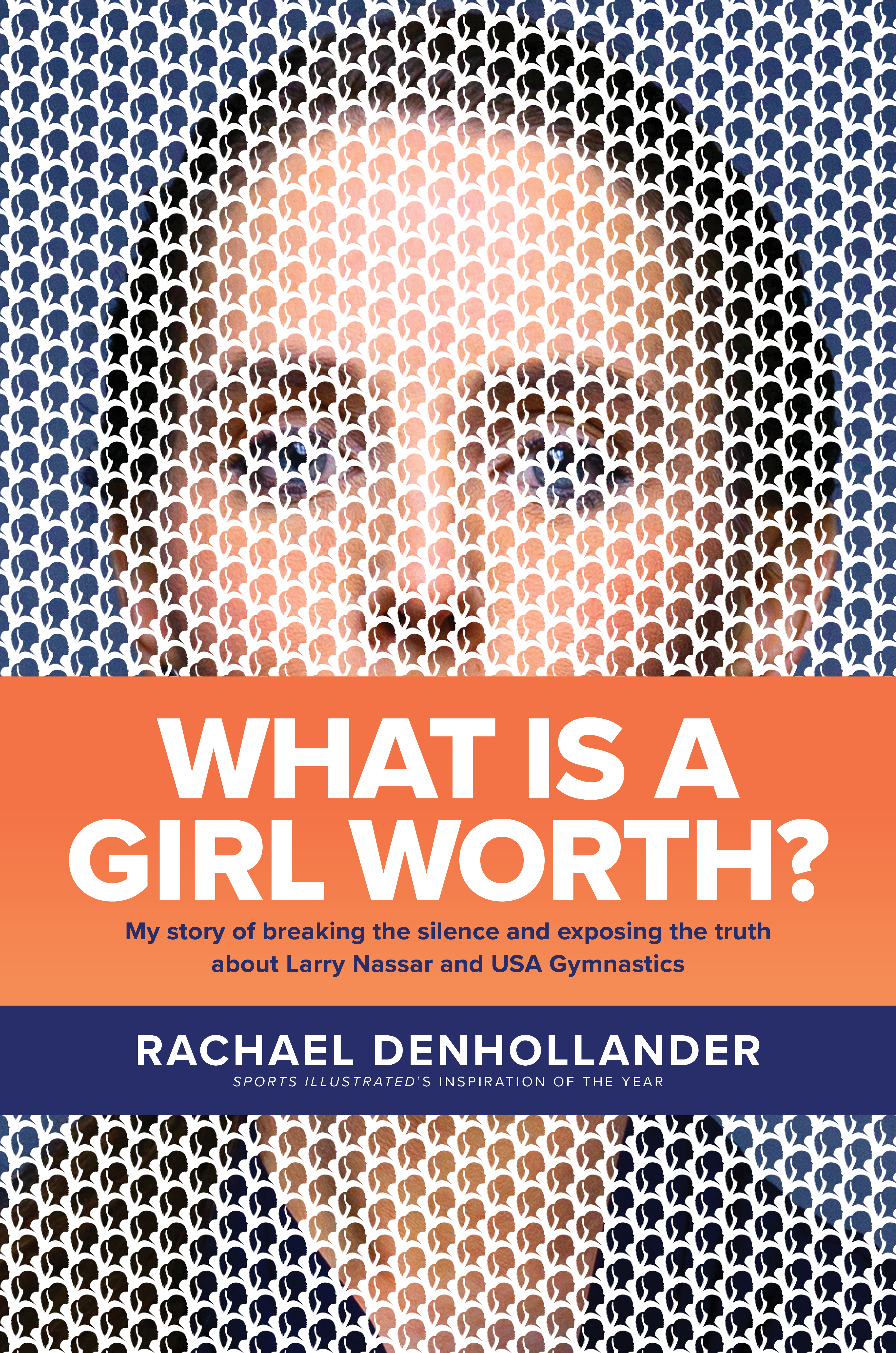
Nowadays, the covers I enjoy designing the most are for books with authors or content that I care the most about. Rachael Denhollander’s What Is a Girl Worth? is one such book. Several years ago, Rachael was instrumental in exposing abuse within the world of US gymnastics and helping hundreds of women come forth to tell their stories of how physician Larry Nassar had abused them. This deeply personal and compelling memoir shines a spotlight on the physical and emotional impact of abuse and shows why survivors are reluctant to speak out, what it means to be believed or not believed, and the extraordinary power of faith and forgiveness. I was blown away by Rachael herself and the powerful story she tells in her book.
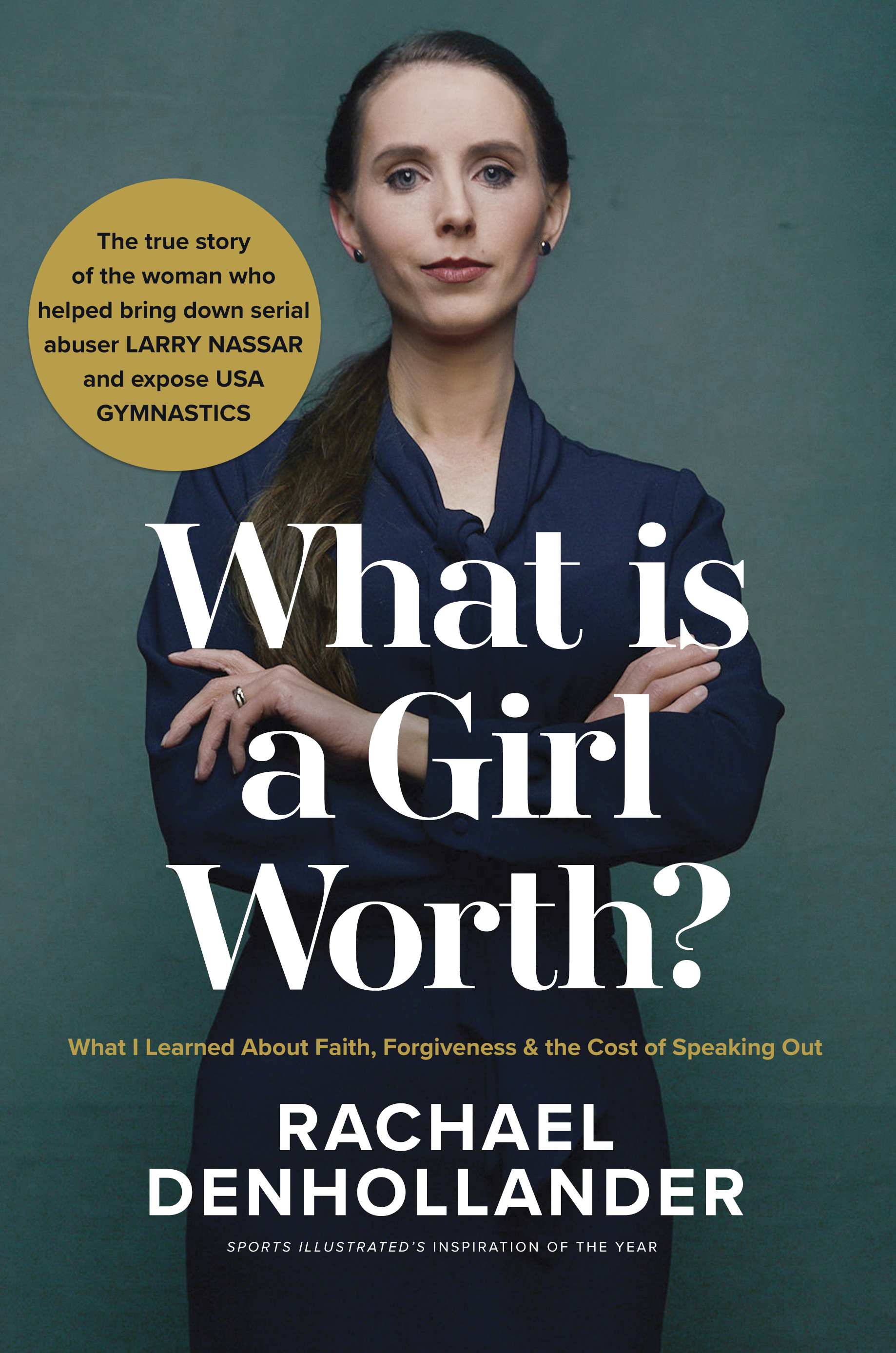
Understandably, I felt the weight and responsibility of making sure the cover for What Is a Girl Worth? did her story justice. As I worked with Sarah Atkinson and the Tyndale Momentum team, we wanted the cover to be confident, strong, and powerful while also conveying vulnerability and compassion. The first cover that we developed achieved all of these goals. We worked up a cover idea, did a photoshoot with Rachael, and was just about to send the final cover to the author and agent when Sarah got a feeling that we hadn’t quite nailed it. She had this gut instinct that said we were playing it too safe and needed to push the boundaries, especially to ensure the cover would stand out in the TV interviews we knew Rachael would be giving.
So back to the drawing board we went. After exploring a few options that tweaked the original design, I tried something out of left field—and that’s the cover we went with. What made this new cover both dynamic and meaningful is the story behind the design. The cover is dominated by the pointillistic photo of Rachael with a giant bar across her face.
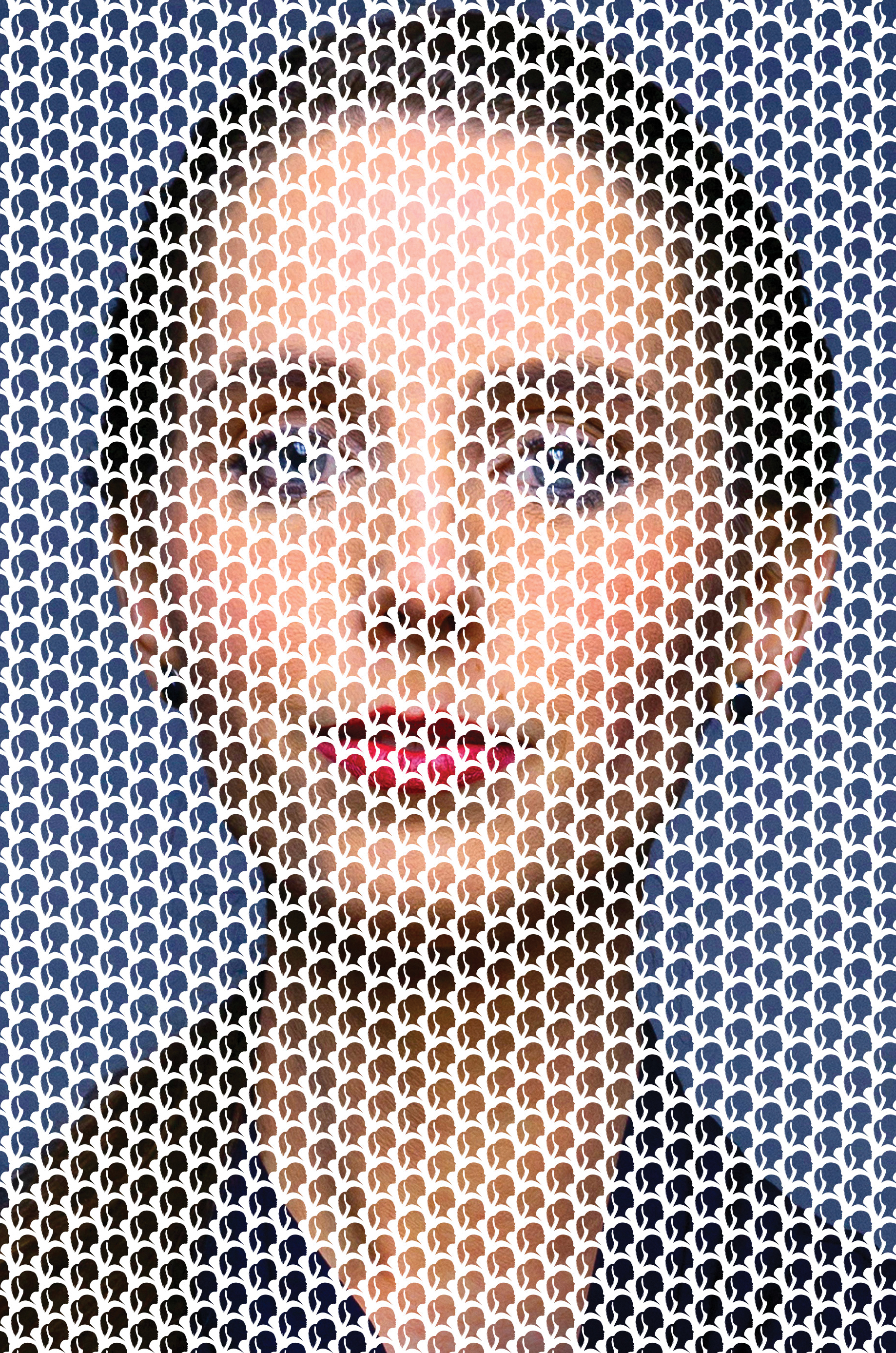
The bar, which is actually the jacket of the book, represents how Rachael was silenced for years and couldn’t report her abuse. Once the jacket is taken off, however, you can see Rachael’s full portrait. She is now free to speak for herself. The devastating effect of abuse on the many victims—and Rachael’s empowering impact on them—is represented by the silhouette of a woman that is repeated over the entire cover and makes up Rachael’s image.
In the end, the cover works on multiple levels: It powerfully tells Rachael’s story while also creating a dramatic visual to draw readers in. The combination of the two made working on this book one of the most fulfilling design experiences of my career.
Learn more about What Is a Girl Worth? by Rachael Denhollander here!


