
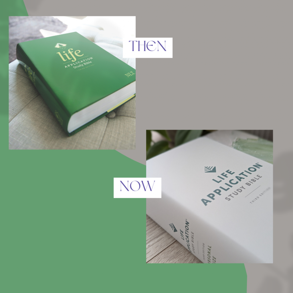
We recently announced that one of the best-loved study Bibles, the Life Application Study Bible, got an updated look. The amazing content is still the same, but our incredible design team has updated the logo and packaging for a more sleek, modern feel.
We thought you’d like to hear from our design team on the update. Jennifer Ghionzoli and Jennifer Phelps, outstanding Bible designers who worked on the project, share their insights.
The refreshed Life Application Study Bible design was created to honor its legacy while also inviting new readers to engage with God’s Word. The cream background of the packaging provides a clean presentation that draws the eye to the LeatherLike Bible binding and title. Along the right side, abstract hills of green hues add warmth and energy—symbolizing the vibrant life found in God’s Word. For the New Living Translation, the abstract painting suggests an evergreen forest. Each translation will feature its own variation, reflecting its unique colorway and history, bringing varied meaning to users from all walks of life, and inviting them deeper into the story of God’s Word.
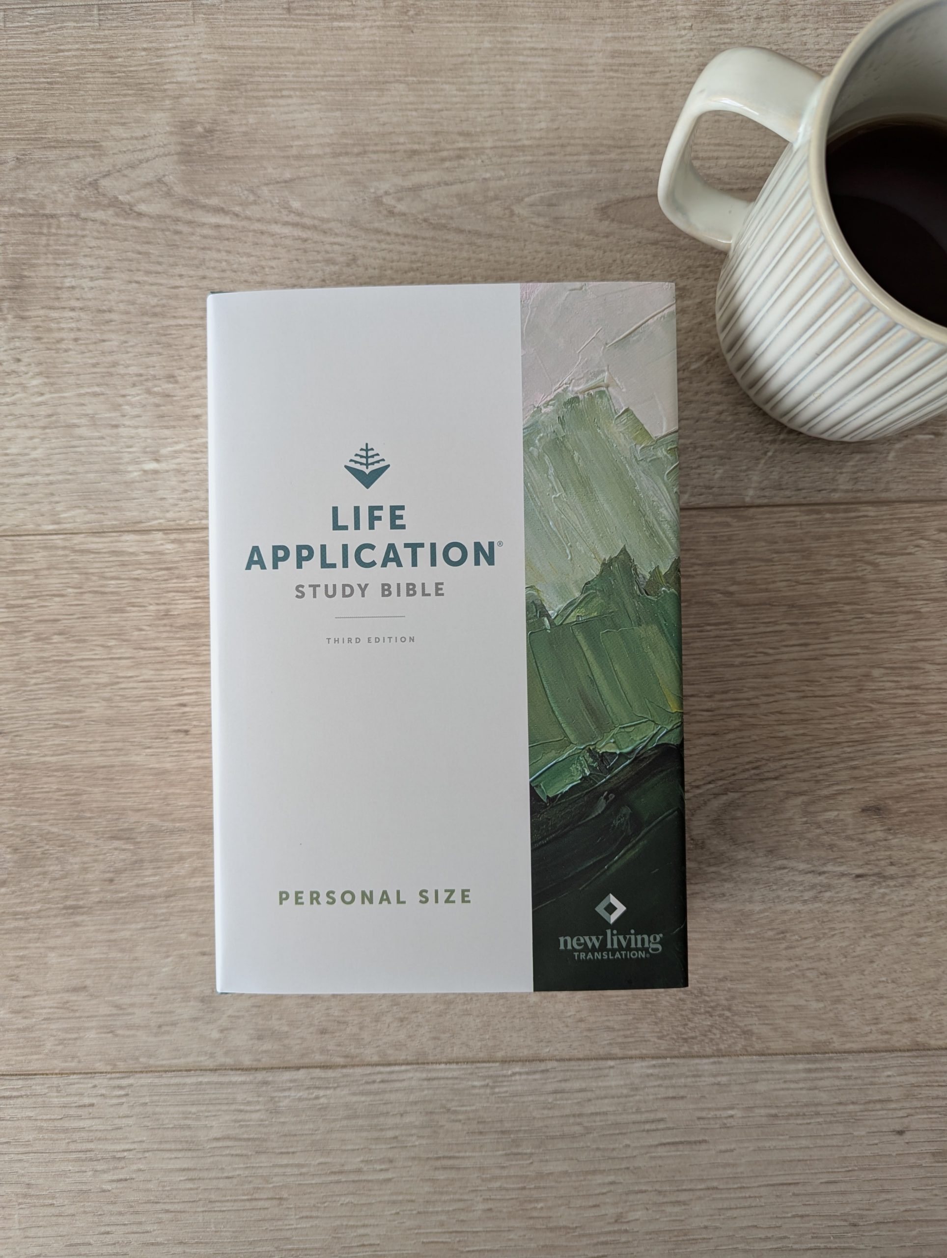
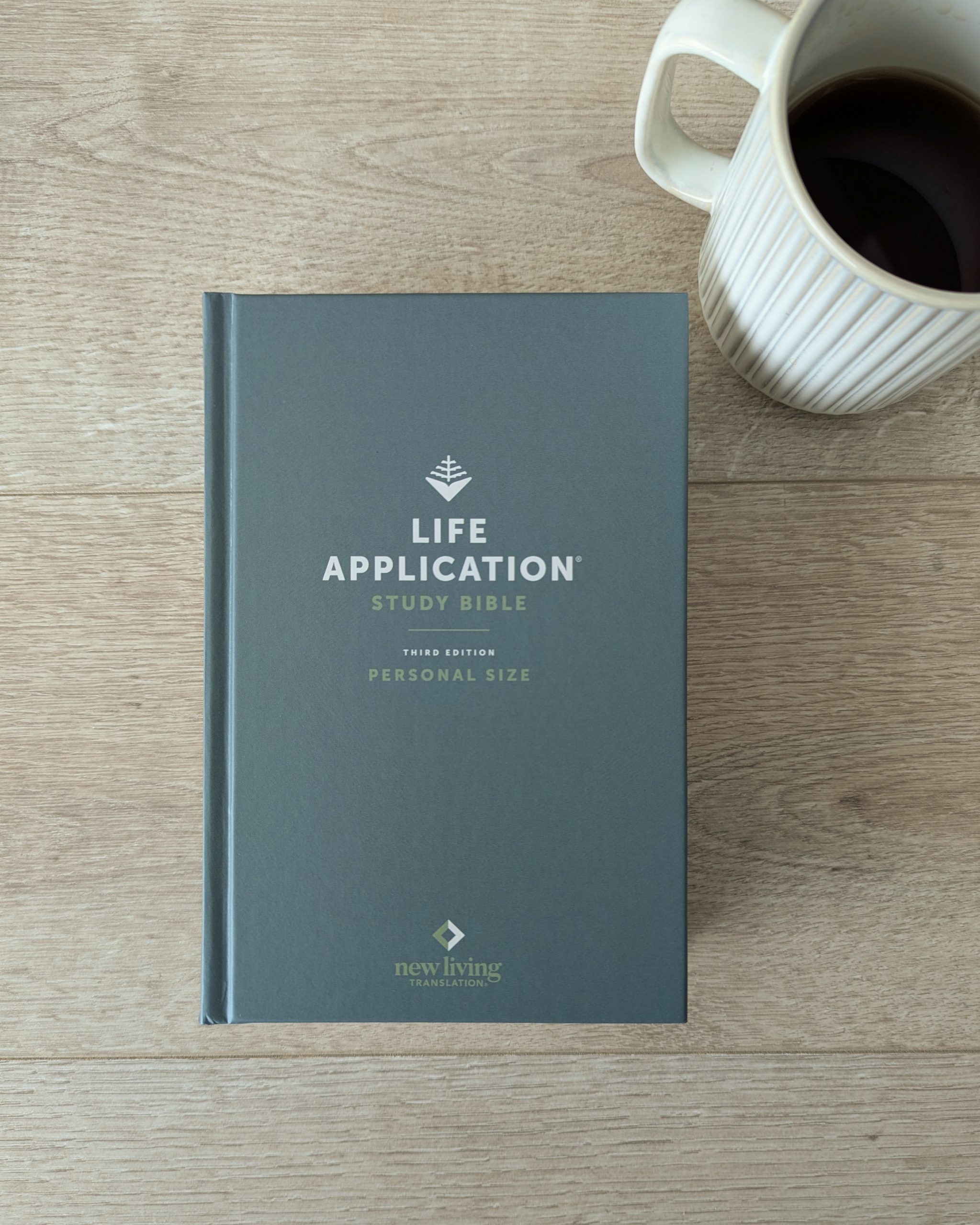
At the heart of the design is the updated evergreen tree logo—a modern, simplified take on the previous logo. Variations of the tree have been used on this Bible for many years. The evergreen has been a visual metaphor for the steadfast, enduring life that Scripture cultivates, bringing lasting heart transformation.
It has truly been an honor for our team to work on this updated Life Application Study Bible design together.
Learn more about the Life Application Study Bible