Hey there, readers. Today our blog post is inspired by Christian fiction blogger Rel from Relz Reviewz. Every release season, Rel posts about upcoming covers from the top Christian fiction publishers.


For us at Crazy4Fiction, it’s always so great to hear reader feedback and see what you’re responding to. What about a book cover makes you want to pick it up? Is there something that turns you off?
Since we enjoy your feedback so much, we thought you might like to hear from us on what initially drew us to each cover—and learn a few fun behind-the-scenes details you wouldn’t know about just from looking.
So though we were always taught not to, let’s judge a book by its cover!
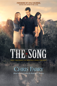
Novelizations tend to use the movie poster as the cover image. Since film schedules work very differently from print schedules, the cover art often comes screeching in at the eleventh hour. In this case, the film had already been completed and the cover was available early, allowing our process to run much more smoothly.
Fun Fact
Alan Powell, who plays Jed King in The Song, is the lead singer of Anthem Lights.
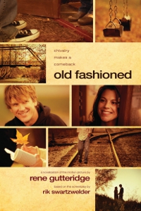
The original image for Old Fashioned didn’t do the book or movie justice, and when our design team came to us with this cover option, even the movie team thought it was good—it became the image they’re using to promote the film.
Fun Fact
Usually it’s the publisher that uses the movie team’s image, but in this instance the roles were reversed. After seeing still shots from the movie, our design team put together the cover you see now, and we knew it was the one.
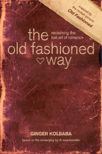
Keeping with the same warm-toned color scheme, we wanted this companion nonfiction piece to tie in seamlessly to the novel Old Fashioned.
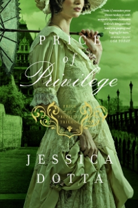
This cover immediately caught my attention because its composition is arresting and beautiful, but the pose and coloring hint at the drama within. Julia has come so far over the course of the series, but she must still face her toughest challenge yet.
Fun Fact
In order to create a uniform look for these three books, we did all of the photo shoots simultaneously. That means the girl you see on book one is the same model as on book three. With this consistency, readers can begin to identify with the character they see on the covers.
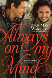
We knew the designer was going to stick with the cover style used for the previous books in the series, but the design team still always surprises and impresses us with the end result. For this cover, we wanted to focus primarily on the romance element, and since the book is releasing in January, the models’ stylish winter ensembles and the title’s red font tie together perfectly to give that romantic Valentine’s Day appeal.
Fun Fact
The cover photo was originally cropped to show a different view of the characters, but after discussion it was decided that seeing the characters straight on would allow readers the best chance to connect with them.
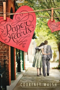
I loved the balance of whimsy and poignancy on this cover right from the start—it’s so fitting for the tone of the story, which is fun, funny, and romantic . . . but also has a depth that will stop you in your tracks. This cover reminded me of so many of my favorite romance movies!
Fun Fact
In addition to being a romance author, Courtney Walsh is known for her mixed media art.
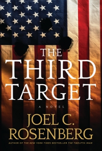
How can you not like Joel’s covers? The designer for Joel’s books hits it out of the park every time. The iconic image of the American flag riddled with bullet holes causes a visceral reaction. It instantly suggests that America is in danger.
Fun Fact
Psst . . . early in-house reviews of this book say it may be Rosenberg’s best novel yet.
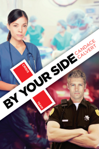
When starting a design for a new series, it can be hard to make a final decision, as you know this is what you’ll have to stick with for the next few books. Once we saw this split-screen design with the play on the red cross, we knew it was the one. It fits the genre and the models give that sense of romance that you find in any Candace Calvert book.
Fun Fact
The handsome cop on this cover was difficult to find, and since the character made an appearance in one of Candace’s previous novels, we couldn’t alter the book’s description of his looks to fit the cover. So . . . our design team built the perfect man. He’s made up of more than one image, and his hair and eye color have been changed to match the character’s.
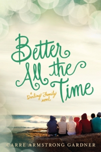
In average everyday life, when we stop to look and observe, we can see the extraordinary in the ordinary. This cover evokes that wonder in me. The struggles of ordinary life are scary, but in the middle of them we can’t forget to remind ourselves of the extraordinary ways in which the Lord works—as the characters on this cover do while gazing at the ocean. Carre captures that in her story, and this cover depicts it almost as beautifully.
Fun Fact
It was hard to describe to the designer what we were looking for on this cover. We wanted it to tie in with All Right Here, the first Darling Family novel, but also be distinct and clearly capture the large Darling family. Not an easy feat! Our designer happened upon this image and realized that the number of people here perfectly matches the number of empty chairs on the cover of All Right Here. Now that was meant to be!
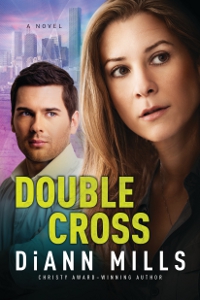
I was immediately drawn to this heroine. She looks strong and smart but also somewhat vulnerable—so fitting for protagonist Laurel Evertson. We talk a lot in our meetings about whether the cover evokes the same tone and mood as the story, and between the characters, background images, and coloring, I think this cover fits DiAnn’s book wonderfully!
Fun Fact
Does anyone else see the cover model and think she bears a striking resemblance to Jennifer Aniston? Now if we could just get Jennifer Aniston to endorse DiAnn’s book, we’d be set!
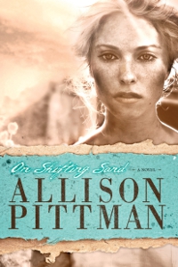
This cover evokes such strong emotion and wonder. Nola’s piercing eyes show her heavy and desperate desire for satisfying love in the midst of the storms in her life. Impactful and stunning!
Fun Fact
This cover image was love at first sight. Unfortunately, the model you see didn’t fit the character’s original description in the book. We tried changing her hair color and making tweaks to the cover, but it didn’t have the same impact. In the end, Allison agreed that it made sense to alter the character’s description to fit the cover.
Hope you enjoyed these behind-the-scenes peeks at our upcoming spring titles.
Stop by Relz Reviews for her thoughts on our Spring 2015 covers!
Any of these books catch your eye? Share your thoughts in the comments!