Take a peek behind the scenes at the cover design process for The Lady’s Mine novel by Francine Rivers, New York Times bestselling author of Redeeming Love and The Masterpiece. In the Q&A below, hear from Dean Renninger, a senior art director here at Tyndale House, about what it was like designing the cover for this historical romance and where the team drew inspiration for the cover.
When you are designing a cover for a historical novel, what’s one of the first steps in your design process? How did that play out for The Lady’s Mine?
For any fiction book, we start by diving into the story to make sure we represent it well. In this case, we had a good summary of the book, the setting, and the key elements: the 1870s gold rush period; the California Sierra Nevada mountains; our heroine’s interest in dress and hat making; the romantic story line; and, of course, the gold mine. We used those as starting points to search for imagery that could represent the story.
For our first round of cover ideas, we focused on some of the more literal elements of the story by showcasing Kathryn in a Western 1870s town. Because this story is a bit lighthearted, we wanted to draw readers in with the beauty of Kathryn’s clothing and portray the fish-out-of-water theme that comes through in the book. We had some fantastic ideas that expressly showed a glimpse of the story inside.
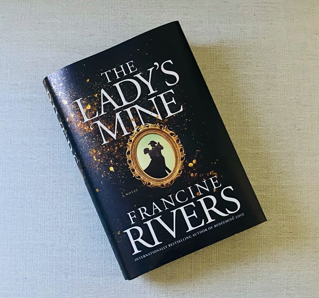
After discussing these directions as a team, we felt we should also explore directions that were more type-driven and conceptual in nature, picking up on a key element or two from the story. We’ve seen this trend work well for other authors, so it seemed prudent to explore that direction as well. That’s when we came up with the idea of playing up the title and selling the story through both the gold specks and the framed image of our heroine and hero dancing in obviously Western clothing. The result is a cover we hope will draw readers in with a hint of a historic Western feel, a bit of fun, and a whole lot of sparkle.
The cover for The Lady’s Mine hints at the novel’s lighthearted romantic story line as well as its rugged gold mining town setting. Can you tell us a little bit about the process of pairing these together for the cover? How did you come up with this concept?
Anytime a story has a bit of humor, it can be tricky to portray that well on the cover. Go too humorous, and it can look silly or cheesy. Don’t go far enough, and the cover feels more serious than the story inside. For The Lady’s Mine, we kept playing with options that introduced gold dust or nuggets onto the cover to reference the gold mine inside. When we found this image that hints at gold dust, we loved the drama it created with the gold set against the black background. This color scheme conveys the tension between the key characters in the story as well as the beauty of the story overall. But that by itself wasn’t enough to express the full story. We did more searching and came across this fantastic image of a couple dancing. We knew it would be a great juxtaposition with the background while telling a more complete picture of the lighthearted, romantic story inside.
We love the way the cover came to life on the final printed book jacket. The gold sparkle and shine are fan favorites already! Can you walk us through how the cover was produced?
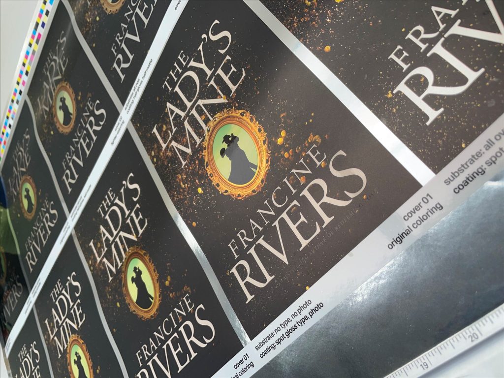
Once we landed on this cover design, we started talking about ways we could add more drama and beauty to it. While we can’t afford a lot of bells and whistles for most books, we knew we wanted to go big on this one because it is Francine Rivers. The easy “bell” to add was the embossing; that always adds depth and a nice tactile feel to any cover. The bigger discussion centered around how to make the gold shine as much as possible. The best way turned out to be printing on a silver metallic paper, which looks like silver foil. The fun part is that we got to decide which areas allowed the shine to come through and which areas were printed normally. We also knew we wanted some areas of the cover to be glossy to add even more shine.
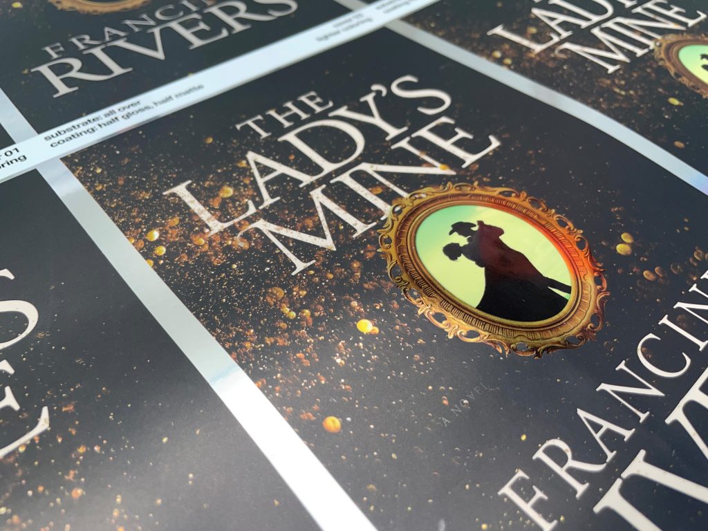
We experimented by creating a variety of options and producing a press test—a short print run on the actual silver metallic paper that gave us an accurate idea of what the final printed cover would look like. Most projects don’t need a press test because we’re fairly certain how they will turn out. But for cases like this where there are a lot of variables, it’s helpful to test the different ways our elements could work together. Once we got those printed samples, we could see which combination of the silver metallic paper, gloss, and embossing allowed the gold dust and picture frame to shine in the most beautiful way.
What was one of your favorite things about designing The Lady’s Mine cover?
While designing a cover can be fun simply for the challenges of design in and of itself, the best design experiences are the ones where I enjoy the people I am working with. I’ve been able to direct the design of many of Francine’s covers during my twenty-plus years at Tyndale, and I’ve seen what a truly genuine, loving, humble person she is. So the best part of working on this cover was knowing that I was playing a tiny part in helping to get a book by this beautiful human being out into the world. And then knowing many people will read this book and see Truth in its pages because of God’s work through Francine’s hands.